Let’s transform our DesignStudioMobileApp from the default template into a proper design studio interface. I’ll create the folder structure and implement all the features that is requested (https://github.com/MIRA-Designs/DesignStudioMobileApp/issues/4).
Step 1: Create Assets Folder Structure 📁
mkdir -p assets/images
📁 Image Location:
Place our design studio image at: assets/images/featured-design.png
📝 Detailed Code Explanation:
1. Import Statements (Lines 8-19)
import React from 'react';
import {
  SafeAreaView,
  ScrollView,
  StatusBar,
  StyleSheet,
  Text,
  View,
  TextInput,
  Image,
  TouchableOpacity,
  useColorScheme,
  Alert,
} from 'react-native';
What Each Import Does:
React– Core React library for component creationSafeAreaView– Renders content within safe area (avoids notch/home indicator)ScrollView– Container that allows scrolling when content exceeds screenStatusBar– Controls device status bar appearanceStyleSheet– Creates optimized styling objectsText– Displays text (like<span>in HTML)View– Basic container (like<div>in HTML)TextInput– Input field for user text entryImage– Displays imagesTouchableOpacity– Touchable button with opacity feedbackuseColorScheme– Hook to detect dark/light modeAlert– Shows native alert dialogs
2. Component State and Handlers (Lines 21-37)
function App() {
  // Hook to detect if device is in dark mode
  const isDarkMode = useColorScheme() === 'dark';

  // Handler function for search input
  const handleSearch = (text: string) => {
    console.log('Search query:', text);
    // You can add search logic here later
  };

  // Handler function for category button press
  const handleCategoryPress = (category: string) => {
    Alert.alert('Category Selected', `You selected: ${category}`);
    // You can add navigation logic here later
  };
Explanation:
isDarkMode– Boolean that’struewhen device is in dark modehandleSearch– Function called when user types in search bar- Parameter:
text: string– what user typed - Action: Logs to console (you can add real search later)
handleCategoryPress– Function called when category button is pressed- Parameter:
category: string– which category was pressed - Action: Shows an alert with selected category
3. Main UI Structure (Lines 39-42)
return (
  <SafeAreaView style={[styles.container, isDarkMode && styles.darkContainer]}>
    <StatusBar barStyle={isDarkMode ? 'light-content' : 'dark-content'} />
Explanation:
SafeAreaView– Main container that respects device safe areasstyle={[styles.container, isDarkMode && styles.darkContainer]}- Array of styles: always applies
container, addsdarkContainerif dark mode StatusBar– Controls status bar text color based on theme
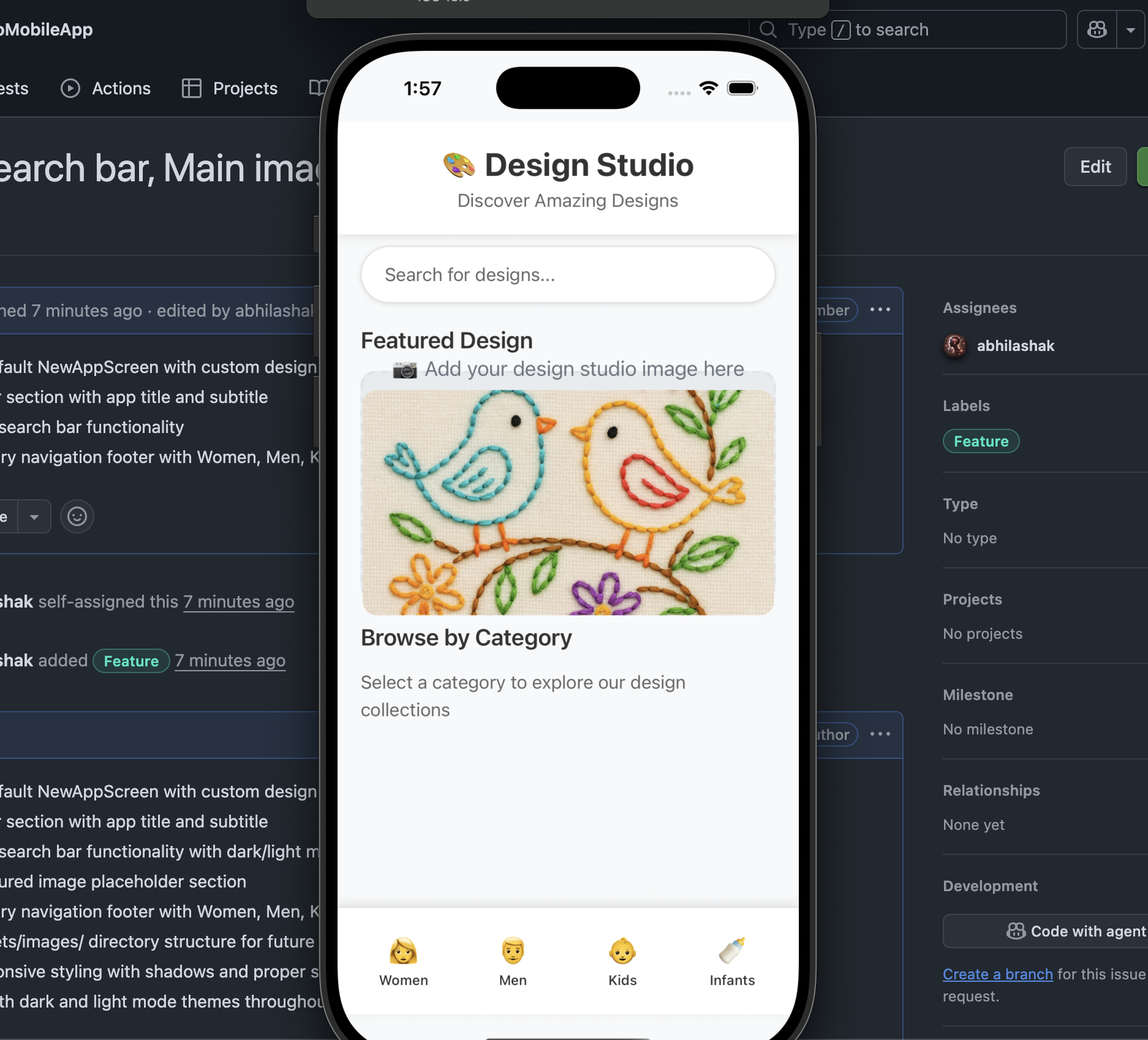
4. Header Section (Lines 45-53)
{/* Header Section with App Title */}
<View style={styles.header}>
  <Text style={[styles.appTitle, isDarkMode && styles.darkText]}>
    🎨 Design Studio
  </Text>
  <Text style={[styles.subtitle, isDarkMode && styles.darkSubtitle]}>
    Discover Amazing Designs
  </Text>
</View>
Explanation:
- Header container with shadow and background
- App title with design studio emoji
- Subtitle with descriptive text
- Dynamic styling that adapts to dark/light mode
5. Search Bar (Lines 55-63)
{/* Search Bar Section */}
<View style={styles.searchContainer}>
  <TextInput
    style={[styles.searchInput, isDarkMode && styles.darkSearchInput]}
    placeholder="Search for designs..."
    placeholderTextColor={isDarkMode ? '#999' : '#666'}
    onChangeText={handleSearch}
  />
</View>
Explanation:
TextInput– The actual search input fieldplaceholder– Text shown when field is emptyplaceholderTextColor– Color that adapts to themeonChangeText={handleSearch}– Calls function when user types- Styling – Rounded corners, shadow, adaptive colors
6. Featured Image Section (Lines 65-85)
{/* Featured Image Section */}
<View style={styles.imageContainer}>
  <Text style={[styles.sectionTitle, isDarkMode && styles.darkText]}>
    Featured Design
  </Text>
  {/* Placeholder for your design studio image */}
  <View style={styles.imagePlaceholder}>
    <Text style={styles.imagePlaceholderText}>
      📷 Add your design studio image here
    </Text>
    <Text style={styles.imagePath}>
      Path: assets/images/featured-design.jpg
    </Text>
  </View>
</View>
Explanation:
- Section title – “Featured Design”
- Image placeholder – Dashed border box showing where to add image
- Instructions – Shows exact path where to place your image
- When you add real image: Replace placeholder with:
  <Image
    source={require('./assets/images/featured-design.jpg')}
    style={styles.featuredImage}
    resizeMode="cover"
  />
7. Content Area (Lines 87-95)
{/* Main Content Area */}
<View style={styles.contentContainer}>
  <Text style={[styles.sectionTitle, isDarkMode && styles.darkText]}>
    Browse by Category
  </Text>
  <Text style={[styles.description, isDarkMode && styles.darkSubtitle]}>
    Select a category to explore our design collections
  </Text>
</View>
Explanation:
- Description section for the category buttons below
- Instructional text to guide users
8. Bottom Footer with Category Icons (Lines 99-143)
{/* Bottom Footer with Category Icons */}
<View style={[styles.footer, isDarkMode && styles.darkFooter]}>

  <TouchableOpacity
    style={styles.categoryButton}
    onPress={() => handleCategoryPress('Women')}
  >
    <Text style={styles.categoryIcon}>👩</Text>
    <Text style={[styles.categoryText, isDarkMode && styles.darkText]}>Women</Text>
  </TouchableOpacity>

  {/* Similar structure for Men, Kids, Infants... */}
</View>
Explanation:
- Footer container – Fixed bottom section with shadow
- Four TouchableOpacity buttons – One for each category
- Each button contains:
- Icon – Emoji representing the category (👩, 👨, 👶, 🍼)
- Label – Text showing category name
onPress– CallshandleCategoryPresswith category nameflex: 1– Each button takes equal space (25% each)
9. Styling Breakdown
Container Styles:
container: {
  flex: 1,                    // Fill entire screen
  backgroundColor: '#f8f9fa', // Light gray background
},
darkContainer: {
  backgroundColor: '#1a1a1a', // Dark background for dark mode
},
Search Input Styles:
searchInput: {
  height: 50,                 // Fixed height
  backgroundColor: '#fff',    // White background
  borderRadius: 25,           // Fully rounded corners
  paddingHorizontal: 20,      // Left/right padding
  fontSize: 16,               // Text size
  borderWidth: 1,             // Thin border
  borderColor: '#e0e0e0',     // Light gray border
  shadowColor: '#000',        // Black shadow
  shadowOffset: { width: 0, height: 1 }, // Shadow position
  shadowOpacity: 0.1,         // Shadow transparency
  shadowRadius: 2,            // Shadow blur
  elevation: 2,               // Android shadow
},
Footer Styles:
footer: {
  flexDirection: 'row',       // Horizontal layout
  backgroundColor: '#fff',    // White background
  paddingVertical: 15,        // Top/bottom padding
  paddingHorizontal: 10,      // Left/right padding
  borderTopWidth: 1,          // Top border
  borderTopColor: '#e0e0e0',  // Border color
  shadowOffset: { width: 0, height: -2 }, // Upward shadow
  elevation: 5,               // Strong Android shadow
},
📱 What You’ll See on Screen:
Top to Bottom Layout:
- 📊 Status Bar – Adapts to light/dark mode
- 🎨 Header – “Design Studio” title with subtitle
- 🔍 Search Bar – Rounded search input
- 📷 Featured Image – Placeholder (will show your image)
- 📝 Content – “Browse by Category” section
- 👥 Footer – Four category buttons (Women, Men, Kids, Infants)
Interactive Elements:
- Search bar – Type to trigger search function
- Category buttons – Tap to show alert (later: navigation)
- Scrollable content – Scroll up/down to see all content
Responsive Features:
- Dark/Light mode – Automatically adapts to device settings
- Safe areas – Respects device notches and home indicators
- Shadows – Proper elevation on both iOS and Android
🎯 Next Steps:
- Add Your Image: Place your design studio image at
assets/images/featured-design.jpg - Replace Placeholder: Uncomment the Image component in the code
- Test Categories: Tap the footer buttons to see alerts
- Customize: Modify colors, sizes, or add more features
Our design studio app is now ready with a professional interface! 🎨📱✨
Let’s see in Part 4..
Happy React Native Development 🚀
 The Rails Drop